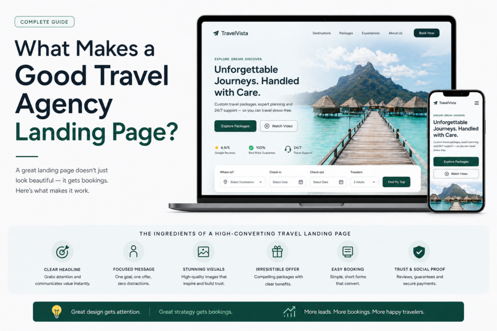
What Makes a Good Travel Agency Landing Page? (Complete Guide) 🛬
🎯 TL;DR A good travel agency landing page has six essential elements: a benefit-driven headline that matches the ad or search result that brought the visitor there, authentic destination photography, a short enquiry form (4–6 fields maximum), specific social proof positioned next to the form, visible trust signals (ATOL/ABTA logos, star rating), and a single clear CTA. Pages built with these six elements consistently convert paid traffic at 4–8% and organic traffic at 2–4%.
💡 Summary Most travel agency landing pages look professional but convert poorly — because looking good and converting well are two different things. A good travel agency landing page is engineered to do one job: turn a visitor into an enquiry. This guide breaks down every element that separates a high-converting travel landing page from one that bleeds budget, with specific examples and actionable fixes for each.
You can spend thousands on Google Ads, build a beautiful Instagram following, and rank on page one of Google — and still get almost no enquiries if your landing page isn’t built to convert.
The landing page is where your marketing investment either pays off or gets wasted. It’s the moment a potential customer arrives, looks around, and decides in 3–5 seconds whether to stay or leave.
So what makes a good travel agency landing page? Not just a good-looking one — but one that consistently turns browsers into bookers?
This guide answers that question completely. 👇
What a Good Travel Agency Landing Page Actually Does
The short answer: A good travel agency landing page has one job — convert a specific visitor from a specific traffic source into a specific action (usually an enquiry). Everything on the page either supports that goal or undermines it.
The distinction between a good landing page and a bad one isn’t usually about design quality. Most travel agency landing pages look decent. The difference is in the details — the headline, the form length, the position of the trust signals, the speed on mobile.
A good landing page answers three questions instantly, before the visitor has scrolled at all:
- Am I in the right place? (Does this page match what I was searching for?)
- Can I trust this agency? (Is there evidence they’re credible and experienced?)
- What do I do next? (Is there a clear, obvious action to take?)
If your landing page answers all three questions in the first 5 seconds — you have a good landing page. If it doesn’t — visitors leave, and your ad spend goes with them.
Element 1: A Headline That Confirms Relevance Immediately
The short answer: The headline is the most important element on a travel agency landing page — it determines whether the visitor stays or leaves, and it must directly reflect the ad or search result that brought them there.
What a Good Headline Looks Like
A good travel agency landing page headline does two things simultaneously: it confirms to the visitor they’re in the right place, and it communicates a clear benefit or promise.
Weak headline (what most agencies use): “Welcome to Sunrise Travel — Award-Winning Agency Since 2003”
This headline is about the agency, not the customer. It tells the visitor nothing about whether this page is relevant to their search.
Strong headline (what converts): “Tailor-Made Maldives Honeymoons — Designed by Specialists Who’ve Visited Every Resort”
This headline confirms destination (Maldives), trip type (honeymoon), differentiator (specialists who’ve been there), and communicates genuine expertise — all in one line.
The Message Match Rule
The single most important principle of travel landing page headlines is message match — your headline must reflect the ad or search result that sent the visitor there.
If your Google Ad says “Luxury Maldives Honeymoon Specialists” and your landing page opens with “Holidays Worldwide — Book With Confidence”, you’ve broken message match. The visitor feels they’ve landed in the wrong place and leaves immediately.
Every traffic source needs its own landing page with a headline that mirrors the specific promise made in the ad or search result.
Headline Formulas That Work for Travel Agencies
Formula 1: [Destination] + [Trip Type] — [Specific Differentiator] “Kenya Safari Holidays — Every Camp Personally Inspected by Our Team”
Formula 2: [Trip Type] + [Destination] — [Zero-Risk Offer] “Maldives Honeymoon Planning — Free Personalised Itinerary Within 24 Hours”
Formula 3: [Destination] Specialist — [Credibility Signal] “Japan Holiday Specialists — 500+ Tailor-Made Trips Planned Since 2015”
Element 2: Authentic Photography That Creates Desire
The short answer: Authentic photography — your own images from FAM trips and customer holidays — outperforms stock photography on travel landing pages because it signals genuine expertise and differentiates your agency from every competitor using the same image libraries.
Why Authentic Photography Matters
Travel is the most visual purchase most people make. Before a visitor reads a single word of your copy, your hero image has already told them something about the quality, authenticity, and expertise of your agency.
Stock travel photography is everywhere. The same perfect beach photo, the same sunset safari shot, the same overwater villa image — visitors have seen them hundreds of times on competitor websites and in brochures. They register as generic.
Your own photography — taken during a resort inspection visit, shared by a happy customer, or sourced from a supplier partner — tells a completely different story. It says: we’ve actually been there. We know this destination first-hand. That’s the trust signal that converts.
What Makes a Good Travel Landing Page Hero Image
- Authentic over perfect — a real photo from your Maldives specialist’s last resort visit outperforms a Getty Images beach photo every time
- Emotionally resonant — the image should make the visitor feel something (“I want to be there”)
- Relevant to the specific destination and trip type — a honeymoon page needs romantic imagery; a family safari page needs family-friendly wildlife shots
- Fast-loading — compress every image to under 200KB before uploading (use TinyPNG or ShortPixel)
- Mobile-optimised — hero images should have a portrait crop available for mobile screens
Element 3: A Value Proposition That Answers “Why You?”
The short answer: Every good travel landing page needs a clear, concise answer to the question every visitor is silently asking: “Why should I enquire with this agency rather than booking direct or using an OTA?”
The Feature-to-Benefit Translation
Most travel agencies list features in their value proposition:
- ✓ ATOL Protected
- ✓ 20 Years Experience
- ✓ Tailor-Made Itineraries
These are fine — but they’re not compelling. A good landing page translates every feature into an outcome the customer actually cares about:
| Feature | Benefit |
|---|---|
| ATOL Protected | “Your money is 100% safe — if anything changes, you’re fully covered” |
| 20 Years Experience | “Two decades of relationships with the best resorts and guides in the world” |
| Tailor-Made Itineraries | “Your trip is built around you — not a template, not what’s easiest for us to sell” |
| No Booking Fees | “You pay the same price as booking direct — but with an expert handling every detail” |
| Personally Visited Resorts | “We’ve stayed in every property we recommend — we know what actually lives up to the photos” |
Three to four benefit statements, each written from the customer’s perspective, is the sweet spot.
Element 4: An Enquiry Form That People Actually Complete
The short answer: A good travel agency enquiry form has 4–6 fields, a benefit-driven headline, outcome-oriented submit button text (“Get My Free Itinerary” not “Submit”), a privacy reassurance line, and a clear statement of what happens after submission.
The Form Length Problem
This is where most travel agency landing pages fail. The instinct is to collect as much information as possible upfront — departure airport, number of travellers, room preferences, specific resort requests, how they heard about you.
The data tells a different story: every field you add to a form reduces completion rates by 10–15%. A 10-field form might capture slightly more information from the people who complete it, but a 5-field form will capture significantly more people.
The minimum viable travel enquiry form:
- First name
- Email address
- Phone number (optional — mark it clearly)
- Destination of interest
- Approximate travel dates
That’s it for a first-touch landing page. Gather everything else in the follow-up conversation.
Form Copy That Converts
Form headline: Don’t leave the form unlabelled. A short headline reinforces the offer.
- “Get Your Free Maldives Honeymoon Itinerary” — specific and benefit-led
- “Speak to a Specialist — Free, No Obligation” — removes the risk
Submit button: Never use “Submit” — it’s passive and tells the visitor nothing about what happens next.
- ✅ “Get My Free Itinerary”
- ✅ “Start Planning My Trip”
- ✅ “Speak to a Specialist”
- ❌ “Submit”
- ❌ “Send”
Privacy line: One sentence beneath the button reduces abandonment significantly. “We’ll never share your details. No spam, ever.”
What happens next: Tell visitors exactly what to expect after submitting. “We respond within 24 hours with a personalised recommendation — completely free, no obligation.”
Element 5: Social Proof Positioned at the Point of Hesitation
The short answer: Social proof — customer testimonials, star ratings, review counts — must be positioned immediately adjacent to the enquiry form, because that’s the moment of maximum hesitation where trust signals have the biggest impact on conversion rate.
The Social Proof Hierarchy for Travel Landing Pages
Not all social proof is equal. Here’s what converts best, from most to least powerful:
- Video testimonials — even selfie-style videos from real customers
- Photo + detailed written testimonial with name, destination, and trip date
- Written testimonial with specific trip details (no photo)
- Independently verified rating — Trustpilot or Google review widget
- Review count statement — “Rated 4.9/5 by 600+ travellers”
What Makes a Testimonial Convert
Weak testimonial (doesn’t convert): “Great service, would definitely recommend!” — Sarah M.
Strong testimonial (converts): “We had no idea where to start with our Maldives honeymoon. [Agency] recommended a resort we’d never have found ourselves — the house reef was incredible. Everything from flights to the welcome hamper was perfectly arranged. We’ll never book a big trip any other way.” — Sarah & James, Maldives Honeymoon, October 2024
The difference: specific details, a real outcome, a named couple, a destination and date. Specificity is credibility.
Where to Place Social Proof
- Immediately above the enquiry form — or directly beside it on desktop
- In the hero section — a review count and star rating in a trust bar below the hero image
- Near the bottom of the page — for visitors who scroll through before deciding
Element 6: Trust Signals That Remove Hesitation
The short answer: Travel customers are handing over significant sums of money for an experience weeks or months away — trust signals (ATOL/ABTA logos, review ratings, team photos, press mentions) directly reduce the hesitation that stops visitors from enquiring.
The Essential Trust Signals for UK Travel Agencies
ATOL and ABTA logos — non-negotiable. Display them prominently with a brief explanation: “Every booking is ATOL protected — your money is 100% safe.”
Review count and rating — “Rated 4.9/5 by 600+ travellers” is more credible than a star rating alone. Use an independently verified widget (Trustpilot or Google) where possible.
Years in business / trips planned — “1,200+ tailor-made holidays planned since 2008” communicates experience tangibly.
Team headshot — a photo of the specialist who will handle the enquiry, with a brief intro, near the form. Human faces build trust at the moment of maximum hesitation.
Press mentions — if your agency has been featured in travel media, include the publication logos.
The Trust Bar — Fast and Effective
A horizontal band of trust signals immediately below the hero image is one of the highest-impact design elements on a travel landing page. It takes up minimal space but is seen by almost every visitor:
ATOL Protected | 4.9★ Trustpilot | 600+ Holidays Planned | 20 Years Experience | No Booking Fees
Element 7: Mobile Optimisation — Non-Negotiable
The short answer: Over 60% of travel search traffic arrives on mobile — a landing page that isn’t fully optimised for mobile is losing the majority of its potential enquiries before they’ve read a single word.
What Mobile Optimisation Actually Means
It’s not just about the page looking good on a small screen. Mobile optimisation for travel landing pages means:
- Page loads in under 3 seconds on a mobile connection (test at pagespeed.web.dev)
- CTA button is large enough to tap — minimum 44×44px
- Form fields are easy to fill in on a touchscreen — large enough to tap, 16px+ font size
- Phone number is click-to-call — tapping it opens the phone dialler automatically
- No elements overflow horizontally on small screens
- Hero image has a mobile-appropriate crop — tall portrait images work better than wide landscape ones on mobile screens
Test your landing page on your own phone right now. If anything feels awkward — it’s costing you leads.
Element 8: A Single, Clear Call to Action
The short answer: A good travel landing page has one primary CTA — the enquiry form — and everything else on the page supports and leads toward that single action. Multiple competing CTAs dilute attention and reduce overall conversion rate.
The One CTA Rule
It’s tempting to give visitors multiple options — “Enquire Now”, “Download Our Brochure”, “Follow Us on Instagram”, “Sign Up for Our Newsletter”. More options feels more helpful.
But conversion data consistently shows the opposite. When visitors have multiple options, they often choose none — a phenomenon called choice paralysis. The more pathways you offer away from your primary CTA, the lower your conversion rate.
On paid traffic landing pages: Remove the navigation menu entirely. The visitor should have two choices — enquire, or leave. That’s it.
On organic SEO pages: Keep navigation but make the enquiry CTA visually dominant — larger, higher-contrast colour, more prominent position than any other clickable element.
Secondary CTAs — The Safety Net
For visitors who’ve scrolled through everything and still aren’t ready to fill in the form, a secondary CTA at the bottom of the page captures them rather than losing them entirely:
- Phone number with “Call us now — Mon–Fri 9am–6pm”
- WhatsApp button — “Chat with a specialist now”
- Lead magnet — “Download our free Maldives Planning Guide”
The Good Travel Landing Page Checklist
Run through this checklist on your highest-traffic landing page right now:
Headline & Message Match:
- Headline speaks to the customer’s desired outcome, not your agency
- Headline matches the ad or search result that sent the visitor there
- Sub-headline expands the promise and includes a zero-risk offer
Photography:
- Hero image is authentic (your own photography preferred)
- Image is compressed to under 200KB
- Image is emotionally resonant and destination-relevant
Value Proposition:
- 3–4 benefit statements written from customer’s perspective
- Each benefit is outcome-focused, not feature-focused
Form:
- 4–6 fields maximum
- Form headline reinforces the offer
- Submit button uses outcome-oriented copy
- Privacy reassurance line present
- “What happens next” statement present
Social Proof:
- Positioned adjacent to the form
- At least one specific, detailed testimonial with name and trip details
- Review count displayed with context
Trust Signals:
- ATOL/ABTA logos visible without scrolling
- Star rating and review count in trust bar
- Team headshot near the form
Mobile:
- Loads in under 3 seconds on mobile
- CTA button minimum 44×44px
- Form fields easy to complete on touchscreen
- Tested on a real mobile device
CTA:
- Single primary CTA
- Navigation removed on paid traffic pages
- Secondary CTA at bottom of page
Frequently Asked Questions
What makes a good travel agency landing page different from a regular website page? A good travel agency landing page has a single goal — generate an enquiry — while a regular website page serves multiple purposes. Landing pages remove navigation menus (for paid traffic), have one CTA, and are message-matched to a specific traffic source. A website homepage is designed to introduce your whole agency; a landing page is designed to convert one specific visitor into one specific action.
How long should a travel agency landing page be? For paid traffic, shorter pages (600–900 words) with a clear hero, form, social proof, and FAQ typically outperform longer pages. For organic search traffic, longer pages (1,500–2,500 words) with comprehensive destination information rank higher and convert better because organic visitors are in research mode. Match page length to traffic source intent.
What is the most important element of a travel landing page? The headline is the most important element. It determines whether visitors stay or leave in the first 3–5 seconds. A specific, benefit-driven, message-matched headline can improve conversion rates by 2–3x compared to a generic agency-focused headline. The second most important element is the enquiry form — specifically its length and the copy surrounding it.
How many form fields should a travel agency landing page have? 4–6 fields is the optimal range for a first-touch travel enquiry form. The essential fields are: name, email, destination, and approximate dates. Phone number is useful but should be optional. Everything else — departure airport, number of travellers, specific resort preferences — should be gathered in the follow-up conversation, not on the form.
Should I use the same landing page for Google Ads and Facebook Ads traffic? No — different traffic sources need different pages. Google Ads visitors are in active search mode and respond well to direct enquiry CTAs. Facebook Ads visitors are in browsing mode and often convert better with a softer first ask (free guide download or free consultation). Separate pages for each source improve performance on both channels.
How do I know if my travel landing page is good? The primary measure is conversion rate — what percentage of visitors submit the enquiry form. For paid search traffic, 4–8% is good. For organic traffic, 2–4% is good. If your rate is below these benchmarks, your landing page needs work. Use Google Analytics 4 to track conversion rate and Hotjar or Microsoft Clarity (both free) to see heatmaps of where visitors click and how far they scroll.
Do I need a separate landing page for every destination? Yes — for paid campaigns, each major destination should have its own dedicated landing page. A Maldives ad going to a Maldives page converts significantly better than a Maldives ad going to a generic holidays page. For organic traffic, destination-specific pages also rank better because they’re more topically relevant to destination-specific search queries.
What is the biggest mistake travel agencies make with landing pages? Sending paid traffic to the homepage. The homepage is designed for every type of visitor — it has navigation menus, multiple destinations, general information about the agency. A landing page is designed for one specific visitor with one specific intention. The conversion rate difference between a homepage and a dedicated landing page for paid traffic is typically 3–5x.
Final Thoughts
What makes a good travel agency landing page isn’t mystery or magic — it’s the consistent, deliberate execution of eight elements: a message-matched headline, authentic photography, a clear value proposition, a short enquiry form with good copy, well-positioned social proof, visible trust signals, mobile optimisation, and a single CTA.
Get all eight right and your landing page becomes your most valuable marketing asset — working around the clock to convert every visitor your SEO, ads, and social media efforts send its way.
Start with your highest-traffic landing page. Run through the checklist above. Fix the lowest-scoring elements first. Then test, measure, and improve consistently.
For the complete picture of travel agency landing pages — including how to write the copy, design the layout, and optimise conversion rates over time — explore the full series:
- 📝 How to Write Landing Page Copy for Travel Agencies
- 🎨 Landing Page Design Tips for Travel Agencies
- 📈 How to Increase Landing Page Conversion Rate for Travel Agencies
- 🛬 Travel Landing Pages That Convert — The Complete Guide
And for the full travel agency digital marketing strategy, head back to our Complete Digital Marketing Guide for Travel Agencies. 🌍