Travel Landing Pages That Convert: The Complete Guide for Travel Agencies 🛬
💡 Summary A great travel ad or top Google ranking means nothing if the page people land on doesn’t convert. Most travel agency landing pages lose up to 97% of visitors without capturing a single enquiry. In this guide, I’ll show you exactly how to build travel landing pages that convert — covering structure, copy, design, trust signals, and the specific elements that turn browsers into bookers.
You could have the best Google Ads campaign in your industry. You could be ranking #1 on Google organically. You could be running perfectly targeted Instagram ads to a warm, engaged audience.
And still get almost no enquiries — if your landing page isn’t built to convert.
A travel landing page is the page a potential customer arrives on after clicking your ad, your Instagram link, or your Google result. It has one job: to turn that visitor into an enquiry.
Most travel agency websites fail at this. They send paid traffic to their homepage (which is designed to introduce the whole business, not convert a specific visitor). They have cluttered pages with too many options and no clear next step. They bury their phone number. They use stock photography that looks identical to every other travel website on the internet.
The result? Visitors arrive, browse briefly, and leave — often to a competitor whose page made it easier to take the next step.
This guide shows you how to build landing pages that don’t do that. 👇
The Difference Between a Website Page and a Landing Page
Before getting into the how, it’s important to understand what a landing page actually is — because it’s different from a standard website page in a crucial way.
A website page (like your homepage or About page) is designed to serve multiple purposes and multiple types of visitor. It has navigation menus, links to other sections, general information about your agency, and many different pathways a visitor can take.
A landing page is designed for one specific visitor, arriving from one specific source, with one specific goal. Everything on the page is engineered to move that visitor toward a single action — usually an enquiry, a phone call, or a lead magnet download.
The core principle is called message match: the headline, imagery, and copy on your landing page should directly and immediately reflect the ad, email, or search result that brought the visitor there.
If someone clicks a Google Ad for “luxury Maldives honeymoon specialist” and lands on your generic homepage, there’s a message mismatch. They have to hunt for relevance. Most won’t bother.
If they land on a page with the headline “Tailor-Made Maldives Honeymoons — Planned by Specialists Who’ve Been There” — they immediately know they’re in the right place.
That’s the difference between a 1% conversion rate and a 5% conversion rate.
The Anatomy of a High-Converting Travel Landing Page
Every high-converting travel landing page has the same core structure. Here’s each section — what it is, why it matters, and how to get it right.
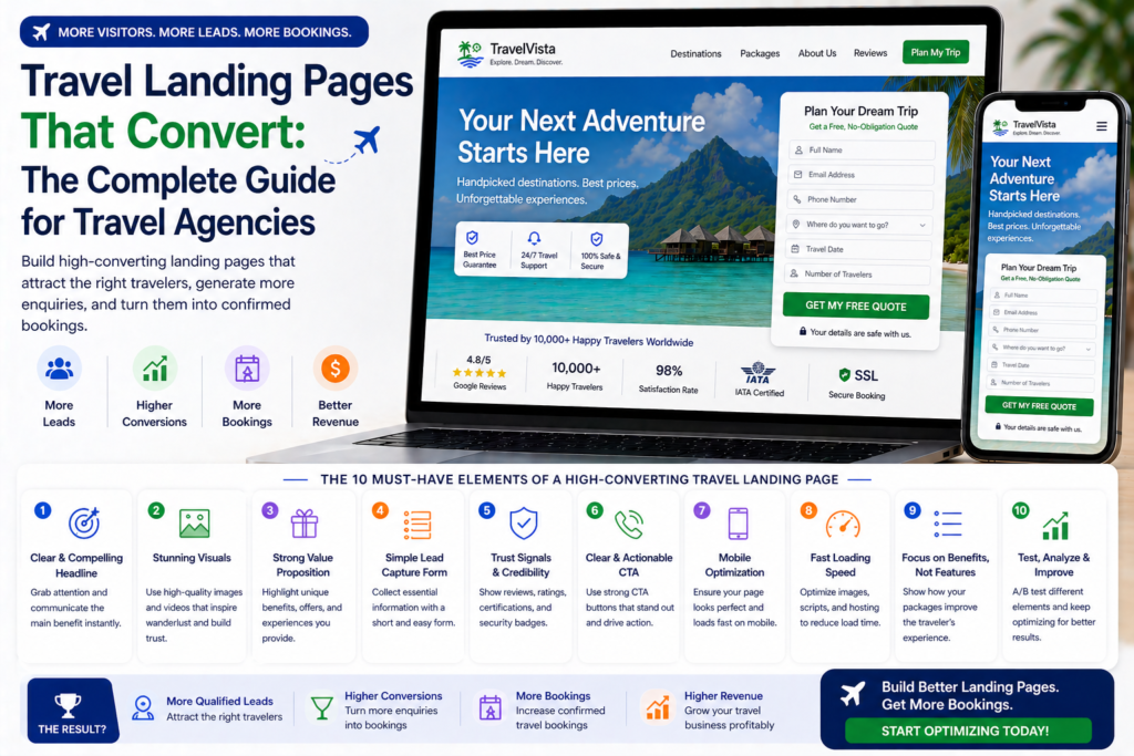
Section 1: The Hero (Above the Fold)
The “above the fold” section is everything the visitor sees before scrolling — typically the top 600–800 pixels of the page. This is the most important real estate on your entire landing page. If it doesn’t immediately communicate value and relevance, most visitors will leave.
What your hero section needs:
Headline: The most important element on the page. It should directly reflect the search term or ad that brought the visitor here, communicate your specific value proposition, and make the visitor feel they’ve found exactly what they were looking for.
Weak headline: “Welcome to Sunrise Travel Agency” Strong headline: “Tailor-Made Maldives Honeymoons — Planned by Specialists Who’ve Visited Every Resort”
Sub-headline: One sentence that expands on the headline promise and tells the visitor what to do next.
Example: “Tell us your dream honeymoon and we’ll design a personalised itinerary — free, no obligation, within 24 hours.”
Hero image or video: A stunning, authentic image (or short autoplay video) of the destination. Your own photography performs significantly better than stock imagery — it’s specific, real, and differentiates you from every other travel agency using the same Getty Images library.
Primary CTA: A highly visible button or form — above the fold, no scrolling required. The CTA text should describe the action and the outcome: “Get My Free Honeymoon Itinerary” beats “Submit” every time.
Trust bar: A thin horizontal band below the hero image showing your key trust credentials at a glance — ATOL Protected, 4.9★ on Trustpilot, 500+ Couples Planned, 20 Years Experience. Visitors scan this in 2 seconds and it significantly reduces hesitation.
Section 2: What You’re Offering (The Value Proposition)
Below the hero, you need to clearly answer the question every visitor is silently asking: “Why should I enquire with you rather than googling it myself or going to Booking.com?”
This section should be short and scannable — three to four benefit statements, each addressing a specific reason to choose your agency over the alternatives.
Format that works well:
Three columns, each with an icon, a short headline, and 1–2 sentences of explanation.
Column 1: Expertise 🌴 We’ve visited every resort we recommend “Our Maldives specialists have personally stayed at 40+ properties across 8 atolls. We know which resorts live up to the photos — and which ones don’t.”
Column 2: Personalisation ✏️ Your trip, built around you “No two itineraries are the same. We design every holiday around your dates, budget, and preferences — not around what’s easiest for us to book.”
Column 3: Peace of Mind 🛡️ Fully protected, fully supported “Every booking is ATOL protected and comes with 24/7 support throughout your trip. If anything changes, we handle it.”
Section 3: The Enquiry Form (Primary Conversion Element)
Your enquiry form is the centrepiece of your landing page — and it’s the element most agencies get wrong.
Form length: The shorter, the better. Every extra field reduces completion rates. For a first-touch landing page, ask only for:
- First name
- Email address
- Destination of interest (pre-filled or dropdown if you’re running destination-specific pages)
- Approximate travel dates
- Approximate budget (optional — but helps qualify leads)
A 10-field form might capture more information from the people who complete it. A 4-field form will capture twice as many people completing it. You can gather the rest in the follow-up conversation.
Form headline: Don’t leave the form unlabelled. A short headline above the form sets expectations and reinforces the offer.
Examples:
- “Get Your Free Maldives Honeymoon Itinerary”
- “Speak to a Specialist — Free, No Obligation”
- “Tell Us About Your Dream Trip”
Submit button text: Never use “Submit.” Use action-oriented, outcome-focused language:
- “Get My Free Itinerary”
- “Start Planning My Trip”
- “Speak to a Specialist”
- “Request My Free Quote”
Privacy reassurance: A single line beneath the form reduces abandonment significantly. “We’ll never share your details. No spam, ever.”
What happens next: Tell people what to expect after they submit. Uncertainty causes drop-off. “We’ll respond within 24 hours with a personalised itinerary and recommendations.”
Section 4: Social Proof
Social proof is the element that closes the deal for hesitant visitors. A potential customer who’s been browsing multiple travel agencies will be pushed to enquire with you specifically by the evidence that other people — people like them — have trusted you and had exceptional experiences.
Types of social proof that work in travel:
Detailed customer reviews: Don’t just show star ratings. Show specific, detailed testimonials that speak to the thing your ideal customer cares most about.
Weak: “Great service, 5 stars!” — Sarah M. Strong: “We had no idea where to start planning our honeymoon. [Agency] designed our entire Maldives trip — flights, resort, experiences — and it was exactly what we’d dreamed of. The overwater villa they recommended was perfect. We’ll absolutely use them again.” — Sarah & James, Maldives Honeymoon 2024
Include the customer’s name, the destination, and ideally a photo of them on the trip (with permission). Specificity is credibility.
Review count and rating: “Rated 4.9/5 by 600+ travellers” displayed prominently. If you’re on Trustpilot, include the Trustpilot badge widget — it’s independently verified and carries more weight than a star rating you’ve designed yourself.
Customer photos: A gallery of authentic customer photos from past trips performs exceptionally well on travel landing pages. Real people in real places your agency planned for them — it’s the most powerful form of social proof available.
Press and media mentions: If your agency has been featured in travel media, include the publication logos. “As featured in…” with recognisable travel magazine logos builds instant credibility.
Section 5: Destination Showcase
For destination-specific landing pages, include a visual showcase of what you offer — resorts, experiences, sample itineraries, or a curated selection of the best options in that destination.
This section serves two purposes: it demonstrates the depth of your offering, and it helps the visitor visualise what their trip could look like — which moves them emotionally toward enquiring.
Format options:
- A carousel of resort cards (image, resort name, price indicator, brief description)
- A sample itinerary (Day 1: Arrive at Malé. Transfer to [Resort]. Snorkelling at dusk…)
- A “What’s Included” breakdown for a specific package
Keep this section aspirational but specific. Generic destination photography with no substance is a missed opportunity.
Section 6: Your Agency’s Credentials and Story
Travel customers are handing over significant sums of money for an experience they haven’t had yet. They need to trust you before they’ll enquire.
This section doesn’t need to be long — a short paragraph about your agency’s expertise in this destination, combined with your key credentials, is sufficient.
What to include:
- How long you’ve specialised in this destination
- How many trips/customers you’ve planned to this destination
- Relevant team expertise (your Maldives specialist has visited 40 properties, etc.)
- Industry accreditations (ATOL, ABTA, AITO)
- A photo of your team or your specialist — faces build trust
Example: “Our Maldives specialists have personally visited more than 40 resorts across 8 atolls. Since 2008, we’ve planned over 1,200 Maldives holidays — from first-time budget trips to seven-figure luxury experiences. Every resort we recommend is one we’ve stayed in ourselves.”
Section 7: FAQ Section
An FAQ section addresses the objections and concerns that might be stopping a visitor from enquiring. It reduces hesitation and improves conversion rates — particularly for high-value travel bookings where the customer naturally has more questions.
Common FAQ topics for travel landing pages:
- How much does it cost? (Even a “from” price or price range is better than nothing)
- How does the booking process work? What happens after I enquire?
- Is my money protected if something goes wrong?
- How far in advance should I book?
- What’s included in your service — do you charge a planning fee?
- Can you match prices I’ve found elsewhere?
Answer each question honestly and directly. The FAQ section is not the place for vague marketing language — it’s the place for clear, confidence-building answers.
Section 8: Secondary CTA
End every landing page with a final call to action. Some visitors will scroll to the bottom before deciding whether to enquire — give them a CTA there rather than making them scroll back up.
The secondary CTA can repeat the primary form or use a different mechanism:
- A phone number with a “Call us now” prompt
- A WhatsApp button (“Chat with a specialist now”)
- A calendar booking link (“Book a free 20-minute consultation”)
For high-value travel bookings, a phone number or WhatsApp button as a secondary CTA often converts visitors who want to talk before committing to a form submission.
Landing Page Design Principles for Travel
Beyond structure and copy, the visual design of your landing page significantly impacts conversion rates. Here are the design principles that matter most for travel:
This is the single most impactful design change you can make to a landing page. Navigation menus give visitors 10 different places to go instead of the one action you want them to take.
Remove the navigation from all landing pages used in paid campaigns. Visitors should have two options: enquire, or leave. Nothing else.
(Note: Landing pages used for SEO can retain navigation, as you want Google to crawl and index the rest of your site from those pages.)
Use Authentic Photography
Stock travel photography is everywhere. It looks professional but it doesn’t differentiate you — and sophisticated travel customers can spot it immediately.
Your own photography — from FAM trips, customer-shared images, or a professional travel photographer — is worth investing in. Real images from real places your agency has sent real customers build trust and credibility that stock imagery simply cannot.
Colour and Visual Hierarchy
Use visual hierarchy to guide the visitor’s eye toward your primary CTA:
- Your CTA button should be the most visually prominent element on the page — contrasting colour, generous size, surrounded by white space
- Testimonials should be visually distinct from body text
- Section headings should be clearly larger than body copy
- Don’t use the same colour for everything — differentiation creates emphasis
White Space
Travel agency landing pages often feel cluttered — too much information competing for attention. White space (empty space between elements) is not wasted space. It makes the page feel premium, makes content easier to read, and draws the eye toward what matters.
Luxury travel brands use generous white space as a design signal. It communicates quality.
Mobile-First Design
Design your landing page for mobile first, then adapt for desktop — not the other way around. The majority of your traffic will arrive on a mobile device. If your enquiry form is tiny, your CTA button is hard to tap, or your text requires horizontal scrolling, you’re losing conversions.
Test every landing page on your own phone before publishing it.
Landing Page Variants for Different Traffic Sources
Not all traffic is the same — and the same landing page doesn’t work equally well for every source. Consider creating variants for:
Google Ads Traffic (Paid Search)
- Remove navigation (paid traffic should have no distractions)
- Make the headline an exact or close match to the ad headline
- Keep the page focused on a single destination or trip type
- Include a prominent phone number (paid search visitors often want to call)
Facebook/Instagram Ad Traffic (Paid Social)
- Lead with more visual, emotional content — social visitors are in browsing mode, not search mode
- Include a short video if possible — social audiences respond well to video
- Slightly softer initial ask — a lead magnet offer or “free consultation” tends to work better for cold social traffic than a direct “enquire now” CTA
Organic Search Traffic (SEO)
- Can retain navigation — you want Google to crawl your site through these pages
- Longer-form content is appropriate — organic visitors are researching and expect depth
- Include multiple CTAs throughout longer pages (not just at the top and bottom)
- Add a lead magnet offer as an alternative to the main enquiry CTA — captures visitors who aren’t ready to enquire but are willing to exchange an email for a guide
Email Campaign Traffic
- Personalise where possible — “Welcome back, [First Name]” if your email platform supports dynamic content
- Reference the email that brought them there
- Shorter page appropriate — email traffic is warm and pre-qualified, less convincing needed
How to Test and Improve Your Landing Pages
A landing page is never finished — it should be continuously tested and improved based on data.
A/B Testing
A/B testing means running two versions of a page simultaneously (Version A and Version B) with one element changed — and measuring which version converts better.
What to test first:
- Headline — the biggest single lever on conversion rate
- CTA button text — “Get My Free Itinerary” vs “Speak to a Specialist”
- Hero image — your own photography vs a different destination shot
- Form length — 4 fields vs 6 fields
- Social proof placement — testimonials above or below the form
Test one element at a time. Run each test until you have statistical significance (typically 200–500 enquiry-form views minimum). Use a tool like Google Optimize (free) or VWO to manage A/B tests.
Heatmaps and Session Recordings
Tools like Hotjar or Microsoft Clarity (free) show you exactly how visitors interact with your landing page — where they click, how far they scroll, where they drop off.
Common insights for travel landing pages:
- Most visitors don’t scroll past the hero section — your above-the-fold content needs to do more work
- Visitors click on destination images expecting to enlarge them — make images clickable
- The enquiry form is being started but not completed — the form may be too long or asking the wrong questions
Conversion Rate Benchmarks for Travel
Use these as rough targets when assessing your landing page performance:
| Traffic Source | Good Conversion Rate | Excellent Conversion Rate |
|---|---|---|
| Google Ads (Search) | 3–5% | 6–10% |
| Facebook/Instagram Ads | 2–4% | 5–8% |
| Organic Search (SEO) | 1–3% | 3–6% |
| Email Campaigns | 5–10% | 10–20% |
If your conversion rate is significantly below these benchmarks, your landing page — not your traffic source — is likely the problem.
Common Travel Landing Page Mistakes ❌
1. Sending paid traffic to the homepage The homepage is designed for everyone. A landing page is designed for one specific visitor. Never send paid campaign traffic to your homepage.
2. Message mismatch between ad and landing page If your ad says “Maldives Honeymoon Specialists” and your landing page talks about all-inclusive Caribbean holidays, the visitor feels misled. Perfect message match is non-negotiable.
3. Too many CTAs competing for attention “Enquire Now”, “Download our brochure”, “Follow us on Instagram”, “Sign up for our newsletter” — too many options leads to no action. One primary CTA per page.
4. Generic testimonials “Loved the service!” from J.S. converts nobody. Specific, detailed reviews with names, destinations, and trip types convert consistently.
5. Slow page load speed A landing page that takes 5+ seconds to load on mobile loses a significant percentage of visitors before they see a single word of your content. Compress images and test speed with PageSpeed Insights.
6. No follow-up after form submission The journey doesn’t end when someone submits the form. A confirmation page (“Thank you — here’s what happens next”), an immediate auto-response email, and a structured follow-up sequence ensure that enquiry doesn’t go cold. As covered in our email marketing for travel agencies guide, the follow-up sequence is where enquiries become bookings.
Final Thoughts
A high-converting travel landing page is the bridge between your marketing spend and your actual bookings. It’s the moment where all your advertising, content, and SEO efforts either pay off — or don’t.
Get the structure right: a compelling, message-matched hero, a clear and concise value proposition, a short frictionless form, specific social proof, and a single obvious CTA. Remove distractions. Use authentic imagery. Make it fast and mobile-friendly. And test, improve, and test again.
The travel agencies that consistently convert more of their traffic into enquiries aren’t spending more on advertising — they’re converting more of the traffic they already have. A landing page improvement that lifts your conversion rate from 2% to 4% effectively doubles the results of every marketing channel you’re running — without spending an extra penny on ads.
That’s the last post in our complete travel agency digital marketing series. Head back to the Complete Digital Marketing Guide for Travel Agencies for the full picture — and start putting it all into practice. 🌍✈️