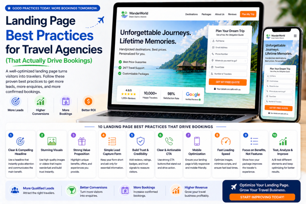
Landing Page Best Practices for Travel Agencies (That Actually Drive Bookings) 🛬
💡 Summary Most travel agency landing pages look good but convert poorly — and the gap between a page that gets traffic and one that generates consistent enquiries comes down to a handful of proven best practices. In this guide, I’ll walk you through every landing page best practice that matters for travel agencies specifically: from the first headline a visitor reads to the form they submit and the follow-up that follows.
You can spend thousands on Google Ads, nail your Instagram targeting, and rank on the first page of Google — and still end up with a trickle of enquiries if your landing page isn’t built to convert.
For travel agencies, this is one of the most common and most costly marketing mistakes. Traffic isn’t the problem. The landing page is.
The good news: most landing page problems are fixable. And the best practices for travel agency landing pages are consistent enough that once you understand them, you can apply them across every destination, campaign, and traffic source you run.
This guide covers everything — what to include, what to remove, how to write it, and how to measure whether it’s working. 👇
Best Practice #1: Match Your Landing Page to Your Ad or Search Result
The single most important landing page best practice is one that most travel agencies ignore: message match.
Message match means the headline, imagery, and core promise of your landing page directly reflect the ad or search result that brought the visitor there.
When someone clicks a Google Ad that says “Luxury Maldives Honeymoon Specialist — Free Itinerary” and lands on a generic homepage about your travel agency’s full range of services, there’s a mismatch. The visitor feels like they’ve landed in the wrong place. Most will leave immediately.
When they land on a page with the headline “Tailor-Made Maldives Honeymoons — Free Personalised Itinerary Within 24 Hours”, they immediately know they’re in the right place. That confidence is the foundation of conversion.
How to implement message match:
- Create dedicated landing pages for each major campaign or destination — not one generic page for all traffic
- Use the same language in your headline as in your ad headline
- Mirror the specific offer (free itinerary, free consultation, specific deal) in both the ad and the page
- If possible, use the same hero image category (Maldives ad → Maldives page imagery)
The tighter the match, the lower your bounce rate — and the higher your conversion rate.
Best Practice #2: Lead with a Benefit-Driven Headline
Your headline is the most important piece of copy on the entire page. It’s the first thing every visitor reads and the primary reason they decide to stay or leave.
Most travel agency headlines are agency-focused: “Welcome to Sunrise Travel” or “Your Trusted Travel Partner Since 2003.” These tell the visitor nothing about what’s in it for them.
Great travel agency headlines are customer-focused and specific. They speak directly to the visitor’s desire and communicate a clear, compelling benefit.
Headline formula for travel landing pages: [Specific trip type] + [Key differentiator] + [Outcome or offer]
Examples:
- “Tailor-Made Maldives Honeymoons — Designed by Specialists Who’ve Visited Every Resort”
- “Kenya Safari Holidays Built Around You — Free Itinerary, No Obligation”
- “Luxury Japan Travel, Expertly Planned — Speak to a Specialist Today”
- “Your Dream Caribbean Cruise, Handled from Start to Finish”
Each of these immediately answers the visitor’s unspoken question: “Am I in the right place, and is this worth my time?”
Sub-headline best practice: Follow your main headline with a single sentence that expands on the promise and tells visitors what to do next.
“Tell us about your dream trip and we’ll design a personalised itinerary — free, no obligation, within 24 hours.”
This is counterintuitive to most travel agency owners — why would you remove parts of your website?
Because navigation menus give visitors choices. And when you’re paying for every click, choices are your enemy.
A navigation menu with 8 links gives visitors 8 reasons to leave your landing page without enquiring. They click “About Us.” They browse “Destinations.” They read your blog. And then they leave — without ever hitting the enquiry form.
The rule: Remove the navigation menu from any landing page used in paid campaigns (Google Ads, Facebook Ads, Instagram Ads).
Visitors should have two options: enquire, or leave. That’s it.
Note: Landing pages used for SEO (organic search) should retain navigation, as Google needs to be able to crawl the rest of your site through internal links.
Best Practice #4: Make Your Primary CTA Visible Without Scrolling
Your call-to-action — the enquiry form, the “Get a Free Quote” button, the phone number — must be visible above the fold. That means visible without scrolling, on any device.
The majority of visitors who will enquire do so within the first 30 seconds of landing on your page. If your CTA requires scrolling to find, you’re losing the visitors who were ready to act immediately.
Above-the-fold CTA best practices:
- Include a short enquiry form or a prominent CTA button in your hero section
- On mobile, the form or button should be the first interactive element visible
- The CTA button colour should contrast visibly with the rest of the page — it should be impossible to miss
- CTA button text should describe the outcome, not the action: “Get My Free Itinerary” not “Submit”
For high-value travel bookings, also include a phone number prominently in the header — many customers prefer to call before submitting a form.
Best Practice #5: Use Authentic Photography, Not Stock Images
Travel is the most visual purchase most people make. The photography on your landing page is doing as much selling as your copy — maybe more.
The problem: most travel agency websites use the same stock photography libraries. Visitors recognise it. Generic beach photos with perfect lighting and no real people don’t build trust — they blend into a sea of identical travel websites.
What to use instead:
- Your own photos from FAM trips and destination visits
- Customer photos from real holidays you’ve planned (with permission)
- Photography from your supplier partners (resorts, safari operators, tour companies often provide high-quality imagery for agents)
- Video footage — even short autoplay clips dramatically increase engagement on travel landing pages
Authenticity signals quality and expertise. A photo taken by your Maldives specialist during their last resort inspection communicates something a stock photo never can: that you’ve actually been there.
Best Practice #6: Keep Your Enquiry Form Short
Every field you add to an enquiry form reduces the number of people who complete it. This is not an opinion — it’s consistently proven by conversion rate data across industries.
For travel agencies, the instinct is to ask lots of upfront questions — trip type, number of travellers, departure airport, accommodation preferences, activities. Understandable, but counterproductive on a first-touch landing page.
The minimum viable travel enquiry form:
- First name
- Email address
- Phone number (optional but useful for travel)
- Destination of interest
- Approximate travel dates
- Approximate budget (optional — use a range dropdown to reduce friction)
That’s six fields maximum for a first-touch page. You’ll collect everything else in the follow-up conversation.
Additional form best practices:
- Label every field clearly
- Use placeholder text to guide completion (e.g. “e.g. Maldives, Kenya, Japan”)
- Include a privacy reassurance line beneath the submit button: “We’ll never share your details.”
- Tell visitors what happens after they submit: “We’ll respond within 24 hours with a personalised recommendation.”
- Make the submit button text action-oriented: “Start Planning My Trip” or “Get My Free Quote”
Best Practice #7: Lead with Social Proof That’s Specific and Credible
Generic five-star ratings don’t convert travel customers. What converts them is specific, detailed evidence that people like them have trusted your agency and had exceptional experiences.
The social proof hierarchy for travel landing pages (most to least powerful):
- Detailed written testimonials with customer name, destination, and trip type — “We couldn’t have planned our Kenya safari without [Agency]. They knew every camp and guide personally, and the experience exceeded everything we’d hoped for.” — Mark & Claire, Kenya Safari 2024
- Customer trip photos — real people in real places your agency planned for them
- Video testimonials — even selfie-style videos from happy customers carry enormous weight
- Independently verified ratings — Trustpilot badge, Google review count, TripAdvisor rating
- Review count — “Rated 4.9/5 by 600+ travellers” is more credible than “Excellent reviews”
- Press and media logos — “As seen in” with recognised travel publication logos
Place your most powerful social proof close to the enquiry form — the point of maximum hesitation. A compelling testimonial positioned immediately above or beside the form can be the deciding factor for a visitor who’s 90% ready to enquire.
Best Practice #8: Address Objections Before They Become Reasons to Leave
Every potential customer who visits your landing page has silent objections — concerns or questions that, if unanswered, become reasons not to enquire. Your landing page should address the most common ones proactively.
The most common objections on travel agency landing pages:
- “How much is this going to cost?” — Include a “prices from” indication or budget range. Transparency builds trust and pre-qualifies leads.
- “Is my money safe?” — Prominently display ATOL and ABTA logos with a brief explanation of what they mean.
- “Do I have to pay to enquire?” — Make it clear the consultation and initial itinerary are free.
- “How quickly will they respond?” — State your response time explicitly (“We respond within 24 hours on weekdays”).
- “Are they actually experts in this destination?” — Include specific credentials: years of specialism, number of trips planned, personal visits to resorts.
An FAQ section near the bottom of the page is an excellent format for handling longer objections. Keep answers concise and direct — this is not the place for marketing language.
Best Practice #9: Create Destination-Specific Pages, Not Generic Ones
One landing page for all destinations is a conversion killer. A visitor searching specifically for a Kenya safari holiday who lands on a generic “Holidays Worldwide” page feels like they’ve arrived at the wrong address.
Best practice: Create a dedicated landing page for each major destination or trip type you run paid campaigns for.
Example page structure:
/maldives-honeymoon— for Maldives honeymoon campaigns/kenya-safari— for Kenya safari campaigns/japan-holidays— for Japan holiday campaigns/luxury-holidays— for luxury travel campaigns
Each page:
- Uses destination-specific headlines and copy
- Features destination-specific photography
- Includes testimonials from customers who’ve been to that destination
- Has a form pre-populated with the destination (or a dropdown defaulting to it)
- Links to relevant destination blog content for visitors who want to research further
This level of specificity improves both your conversion rate (more relevant = more trust = more enquiries) and your Google Ads Quality Score (better ad-to-page relevance = lower cost per click).
Best Practice #10: Optimise for Mobile — Always
More than 60% of travel searches happen on mobile devices. If your landing page doesn’t perform perfectly on a smartphone, you’re losing the majority of your potential enquiries before they’ve read a word.
Mobile optimisation checklist for travel landing pages:
- Page loads in under 3 seconds on mobile (test at PageSpeed Insights)
- Headline is fully visible without zooming or horizontal scrolling
- CTA button is large enough to tap easily (minimum 44×44px)
- Enquiry form fields are large enough to tap and type in comfortably
- Phone number is click-to-call (tapping it automatically opens the phone dialler)
- Images are compressed and sized correctly for mobile screens
- No elements overflow horizontally on small screens
- Navigation (if retained for SEO pages) collapses into a mobile menu
Test your own landing pages on your personal phone right now. If anything feels awkward to use, your visitors feel it too.
Best Practice #11: Tell Visitors Exactly What Happens After They Enquire
One of the most underused conversion tactics on travel landing pages is the process section — a brief, clear explanation of what happens after someone submits an enquiry.
The unknown is a source of hesitation. When visitors don’t know what to expect, some of them decide not to find out.
Example process section:
How it works:
- You tell us about your dream trip (takes 2 minutes)
- We design a personalised itinerary within 24 hours — completely free
- We refine it together until it’s exactly right
- You book with confidence, knowing every detail has been taken care of
This simple sequence removes uncertainty, sets expectations, and makes enquiring feel like the natural next step — not a commitment.
Best Practice #12: Include a Secondary CTA for Visitors Who Aren’t Ready to Enquire
Not every visitor is ready to submit an enquiry form on their first visit. Some are still in the research phase. A secondary CTA captures these visitors rather than losing them entirely.
Effective secondary CTAs for travel landing pages:
- “Download our free [Destination] Planning Guide” — leads them into your email nurture sequence
- “Call us for a no-obligation chat” — phone number with a human invitation
- “Chat with a specialist on WhatsApp” — lower friction than a form for many visitors
- “Read our customer reviews” — sends them to your Trustpilot or Google review page
Position secondary CTAs at the bottom of the page, after your main form. They’re a safety net for visitors who’ve scrolled through your full page and still need one more nudge.
Measuring Landing Page Performance
Track these metrics to know whether your landing pages are performing — and where to focus improvement efforts:
| Metric | What It Measures | Good Benchmark (Travel) |
|---|---|---|
| Conversion rate | % of visitors who submit the form | 3–8% for paid traffic |
| Bounce rate | % who leave without interacting | Under 60% is healthy |
| Time on page | How long visitors spend | 90+ seconds suggests engagement |
| Scroll depth | How far down visitors scroll | Aim for 70%+ reaching the form |
| Form abandonment rate | % who start but don’t finish the form | Under 40% |
| CTA click rate | % who click the CTA button | 5–15% |
Use Google Analytics 4 for traffic and behaviour data, Google Search Console for organic landing page performance, and Hotjar or Microsoft Clarity (both free) for heatmaps and session recordings.
Common Landing Page Mistakes to Avoid ❌
1. One landing page for all campaigns Every campaign and destination deserves its own dedicated page. Generic pages convert at a fraction of the rate of specific ones.
2. Too many CTAs “Enquire Now”, “Download a Brochure”, “Follow Us on Instagram”, “Sign Up for Our Newsletter” — competing CTAs dilute attention. One primary CTA per page.
3. No trust signals ATOL/ABTA logos, customer reviews, review counts, and media mentions all reduce hesitation. Don’t assume visitors already trust you.
4. Slow page speed Image-heavy travel pages are particularly vulnerable to slow load times. Compress every image before uploading. Test speed monthly.
5. No follow-up system A landing page that converts visitors into enquiries is only half the job. An immediate auto-response email and structured follow-up sequence (as covered in our email marketing for travel agencies guide) is what turns those enquiries into bookings.
Final Thoughts
The best practices for travel agency landing pages aren’t complex — but they require consistent, deliberate implementation. Message match, benefit-driven headlines, short forms, specific social proof, destination-specific pages, and mobile optimisation — these are the levers that separate a 2% conversion rate from a 6% one.
And the compounding effect is significant: a landing page improvement that doubles your conversion rate effectively doubles the return on every marketing pound you spend, without increasing your ad budget by a single penny.
Start with your highest-traffic landing page. Apply these best practices. Measure the improvement. Then move to the next one.
For more on building your complete travel agency digital marketing strategy, head back to our Complete Digital Marketing Guide for Travel Agencies. 🌍