Landing Page Mistakes That Kill Travel Bookings (And How to Fix Them) ❌
💡 Summary Most travel agencies blame their ads or their traffic when bookings don’t come in — but the real culprit is almost always the landing page. In this guide, I’ll walk you through the most damaging landing page mistakes travel agencies make, why each one kills conversions, and exactly what to do to fix them fast.
Here’s a scenario that plays out in travel agencies every week.
The Google Ads campaign is live. The targeting looks right. The budget is being spent. Clicks are coming in. But enquiries? Almost none.
The instinct is to blame the ads — wrong keywords, wrong audience, wrong bid strategy. But more often than not, the ads are doing their job. The problem starts the moment the visitor lands on the page.
Landing page mistakes are the silent conversion killers in travel agency marketing. They’re harder to spot than a poorly written ad because they don’t announce themselves — they just quietly turn potential customers into lost opportunities, one visitor at a time.
This guide covers the most common and most damaging landing page mistakes travel agencies make — and exactly how to fix each one. 👇
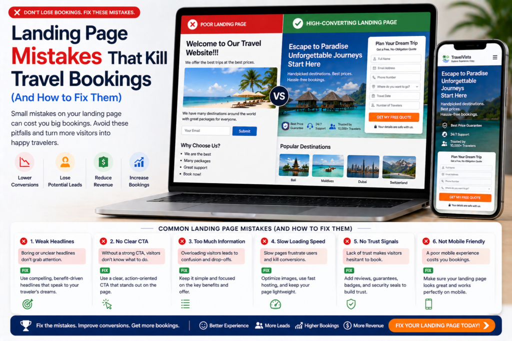
Mistake #1: Sending All Traffic to the Homepage
This is the single most common — and most expensive — landing page mistake travel agencies make.
Your homepage is designed to introduce your entire agency. It has navigation links, multiple destinations, an about section, a blog, social media links, and general information about how you work. It serves every type of visitor and every stage of the buying journey.
That’s exactly why it’s a terrible landing page for paid traffic.
When someone clicks a Google Ad for “luxury Maldives honeymoon specialist” and lands on your homepage, they have to hunt for relevance. They see options for Caribbean cruises, family safaris, adventure travel, ski holidays — and a generic introduction to your agency. Most will leave within 10 seconds, having concluded (incorrectly) that you’re not the right specialist for them.
The fix: Create dedicated landing pages for each major destination and campaign. A Maldives honeymoon ad goes to a Maldives honeymoon page. A Kenya safari ad goes to a Kenya safari page. Each page speaks directly to the specific visitor who clicked that specific ad.
The improvement in conversion rate from this single change alone is typically 2–3x.
Mistake #2: A Headline That Talks About Your Agency, Not the Customer
Open ten random travel agency landing pages right now and count how many lead with something like:
- “Welcome to [Agency Name]”
- “Your Trusted Travel Partner Since 2003”
- “Award-Winning Holidays Worldwide”
These headlines tell the visitor about you. The visitor doesn’t care about you yet. They care about their holiday.
A headline that leads with your agency’s name or history wastes the most important real estate on the page — the first thing every visitor reads — on information that does nothing to persuade them to stay.
The fix: Rewrite your headline around the visitor’s desired outcome. What do they want? What problem does your agency solve for them? What makes staying on this page worth their time?
Before: “Welcome to Sunrise Travel — Award-Winning Agency Since 2001” After: “Tailor-Made Maldives Honeymoons — Designed by Specialists Who’ve Visited Every Resort”
The second headline immediately communicates relevance, specificity, and expertise. The visitor knows within three seconds they’re in the right place.
Mistake #3: Too Many Choices and Competing CTAs
Landing pages that offer too many options — “Enquire Now”, “Download Our Brochure”, “Browse Destinations”, “Follow Us on Instagram”, “Sign Up for Our Newsletter” — consistently underperform pages with a single, clear CTA.
This is known as choice paralysis: when faced with multiple options, visitors often choose none of them. The more pathways you offer away from your primary CTA, the lower your conversion rate.
The fix: Every landing page should have one primary CTA. Everything else on the page should support and lead toward that one action.
If your primary CTA is “Get a Free Itinerary”, your entire page — the headline, the copy, the social proof, the FAQ — should be working to convince the visitor to do exactly that. Nothing should compete with it.
A secondary CTA (phone number, WhatsApp button) is acceptable as a fallback at the bottom of the page for visitors who prefer to call. But it should be clearly secondary — smaller, less prominent, positioned after the main form.
Mistake #4: Stock Photography That Looks Like Every Other Travel Website
Travel is one of the most visually driven purchases people make. The photography on your landing page is doing active selling — communicating quality, authenticity, and trust before the visitor has read a single word of your copy.
The problem: most travel agency websites use the same stock photography libraries. The same perfect beach with no people. The same sunset overwater villa shot. The same safari jeep silhouetted against an orange sky. Visitors have seen these images hundreds of times — on competitors’ websites, in brochures, in Instagram ads. They convey nothing unique about your agency.
The fix: Invest in authentic imagery. Your own photos from FAM trips and destination visits are worth more than any stock library subscription. Customer photos from real holidays you’ve planned (shared with permission) are extraordinarily powerful — they show real people having real experiences that your agency made possible.
If you don’t yet have a library of your own photography, ask your supplier partners (resorts, DMCs, safari operators) for high-quality images they license for agent use. Most are happy to provide them.
Mistake #5: An Enquiry Form with Too Many Fields
Every field you add to an enquiry form reduces completion rates. The data on this is consistent across industries: moving from a 10-field form to a 5-field form typically increases form completions by 30–50%.
Travel agencies often include every possible question upfront — departure airport, number of adults and children, room type preferences, meal board preferences, specific resort requests. The intention is to save time in the follow-up. The result is fewer enquiries making it through in the first place.
The fix: Reduce your first-touch enquiry form to the absolute minimum:
- First name
- Email address
- Phone number (optional but useful)
- Destination of interest
- Approximate travel dates
That’s it. Everything else can be gathered in the follow-up conversation. The goal of the form isn’t to collect a complete brief — it’s to open a dialogue. Get the contact details, then have the conversation.
Mistake #6: No Trust Signals — Or Weak Ones
Travel customers are making high-value purchasing decisions. A Maldives honeymoon might cost £6,000–£12,000. A Kenya safari for a family might be £15,000+. At these price points, trust is everything — and a landing page that doesn’t actively build trust is leaving significant conversion rate on the table.
Common trust signal mistakes:
- No ATOL/ABTA logos — these are non-negotiable for UK travel agencies. Many customers specifically look for these before enquiring.
- Generic star ratings with no context — “5 stars!” from an anonymous reviewer converts nobody.
- Outdated reviews — a testimonial from 2019 feels stale in 2025.
- No review count — “Great agency” carries far less weight than “Rated 4.9/5 by 600+ travellers.”
- No human faces — pages with photos of real team members consistently outperform those without.
The fix: Add specific, credible trust signals throughout your landing page:
- ATOL and ABTA logos with a brief explanation (“Your money is 100% protected”)
- Trustpilot or Google review widget showing your live rating and review count
- Detailed testimonials with customer names, destinations, and trip dates
- Customer trip photos
- A short bio and photo of the specialist who’ll handle their enquiry
- Years of specialism and number of trips planned in that destination
Position your strongest trust signal immediately above or beside the enquiry form — the moment of maximum hesitation.
Mistake #7: Slow Page Load Speed
Every extra second your page takes to load costs you visitors. Research consistently shows that pages taking more than 3 seconds to load on mobile lose a significant percentage of visitors before they’ve seen a single word of content.
Travel landing pages are particularly vulnerable to this because they’re typically image-heavy. Uncompressed hero images, multiple full-resolution photography panels, and embedded video can easily push load times to 6–10 seconds on a mobile connection.
The fix:
- Compress every image before uploading — use TinyPNG or ShortPixel to reduce file sizes by 60–80% without visible quality loss
- Use next-gen image formats (WebP) where your platform supports them
- Lazy-load images below the fold so they don’t block initial page rendering
- Remove unnecessary plugins and scripts (WordPress sites particularly suffer from plugin bloat)
- Test your current speed at PageSpeed Insights (pagespeed.web.dev) — aim for a mobile score above 80
A one-second improvement in load time can increase conversions by 7%. For a travel agency spending £2,000/month on ads, that’s meaningful additional revenue from a purely technical fix.
Mistake #8: No Message Match Between Ad and Landing Page
If your Google Ad says “Maldives Honeymoon Specialists — Free Itinerary” and your landing page headline says “Luxury Holidays Worldwide — Book with Confidence”, there’s a message mismatch.
The visitor who clicked your ad had a specific expectation. When the page doesn’t immediately confirm that expectation, they feel confused or misled — and they leave.
Message mismatch is one of the most conversion-damaging mistakes on landing pages, and it’s surprisingly common. It often happens when agencies create one generic landing page and run multiple different ads pointing to it.
The fix: Every ad needs a landing page that mirrors its specific promise. The headline, sub-headline, and hero image should directly reflect what the ad said.
- Maldives honeymoon ad → Maldives honeymoon landing page
- Kenya safari ad → Kenya safari landing page
- “Free itinerary” offer in the ad → “Free itinerary” prominently stated on the page
This alignment is also critical for Google Ads Quality Score — Google measures the relevance between your ad and your landing page and adjusts your cost per click accordingly. As covered in our Google Ads Quality Score guide, poor ad-to-page relevance directly increases what you pay per click.
Mistake #9: Not Telling Visitors What Happens After They Enquire
Uncertainty stops conversions. When a visitor doesn’t know what to expect after submitting the form — Will someone call them immediately? Will they be added to a mailing list? How long will it take to get a response? — some of them decide not to find out.
This is a particularly significant issue in travel, where the enquiry process involves sharing personal information and potentially entering a sales conversation. Many visitors hesitate because they don’t want to feel pressured.
The fix: Explicitly state what happens next, directly beneath your form:
“Once you submit, here’s what happens:” 1. You’ll receive an immediate confirmation email 2. One of our [Destination] specialists will review your enquiry 3. We’ll send you a personalised itinerary within 24 hours — completely free, no obligation
This simple transparency removes uncertainty, sets expectations, and makes submitting the form feel safe rather than risky.
Mistake #10: No Mobile Optimisation
More than 60% of travel searches happen on mobile. A landing page that looks beautiful on a desktop but is difficult to use on a phone is actively pushing away the majority of your potential enquiries.
Common mobile landing page failures:
- Text too small to read without zooming
- CTA buttons too small to tap accurately
- Enquiry form fields too small and cramped on a small screen
- Images that overflow their containers on mobile
- Phone numbers that aren’t click-to-call
- Navigation menus that don’t collapse properly
- Page speed that’s acceptable on desktop but unbearable on a 4G connection
The fix: Test every landing page on your own phone before publishing. Better still, ask someone else to use it on their phone and watch where they struggle. The friction points that seem minor on a desktop are often deal-breakers on mobile.
Key mobile fixes:
- CTA button minimum 44×44px for comfortable tapping
- Form fields with adequate spacing and font size (minimum 16px to prevent auto-zoom on iOS)
- Phone number formatted as a tap-to-call link (
) - Hero image optimised for portrait (9:16) aspect ratio, not just landscape
Mistake #11: Burying the Phone Number
Many travel customers — particularly those making high-value bookings — want to speak to a human being before they commit to an enquiry. They want to hear a voice, ask a quick question, and feel reassured that there’s a real specialist on the other end.
If your phone number is hidden in the footer, not visible above the fold, or absent from the page entirely, you’re losing these customers.
The fix: Display your phone number prominently in the header of every landing page — visible without scrolling on both desktop and mobile. Make it a click-to-call link on mobile.
Consider adding a supporting line: “Prefer to talk? Call us free: [number] — Mon–Fri 9am–6pm.” This removes the friction and sets expectations about availability.
A visible phone number also functions as a trust signal — it tells visitors there are real people behind the website who are reachable.
Mistake #12: No Follow-Up After Form Submission
The job of a landing page isn’t done when a visitor submits the form. What happens in the next 24 hours is just as important as the page itself.
Common post-submission mistakes:
- No immediate auto-response email — the visitor wonders if their enquiry was received
- A generic “Thank you for your submission” confirmation page with no useful information
- No structured follow-up if the first response goes unanswered
- Manual follow-up only — meaning busy periods lead to slower response times and lost enquiries
The fix: Build an automated post-submission sequence:
- Immediate confirmation email — acknowledges receipt, confirms response time, sets warm expectations
- Personalised response within 24 hours — the actual itinerary or consultation offer
- Follow-up email at 48 hours if no reply — a gentle “did my email reach you?” message
- 7-day follow-up if still no response — a final check-in that leaves the door open
As covered in our email marketing for travel agencies guide, this automated follow-up sequence is what transforms a landing page enquiry into a confirmed booking — and it’s the piece most agencies have in place.
Quick Audit: How Many of These Mistakes Is Your Page Making?
Run through this checklist on your highest-traffic landing page right now:
- Does it have a dedicated page (not your homepage) for each major campaign?
- Does the headline speak to the customer’s outcome, not your agency?
- Is there a single, clear primary CTA — with no competing options?
- Does it use authentic photography rather than stock images?
- Is the enquiry form 6 fields or fewer?
- Are ATOL/ABTA logos and specific customer reviews prominently displayed?
- Does it load in under 3 seconds on mobile? (Test at pagespeed.web.dev)
- Does the headline match the ad or search result that sent visitors there?
- Does it clearly state what happens after the form is submitted?
- Is it fully functional and easy to use on a mobile phone?
- Is the phone number visible above the fold?
- Is there an automated follow-up email sequence triggered on submission?
If you checked fewer than 8 of these boxes, your landing page is costing you bookings. Fix the lowest-scoring items first — they’ll have the biggest immediate impact.
Final Thoughts
Every one of these landing page mistakes is fixable. None of them requires a complete website rebuild or a large budget. Most can be addressed in a day or two of focused work.
The compounding effect of fixing multiple mistakes simultaneously can be dramatic. Moving from a 2% to a 5% conversion rate on a page receiving 500 monthly visitors means going from 10 enquiries per month to 25 — without changing your ad spend, your keyword strategy, or your social media presence.
Your landing page is the most leveraged conversion asset in your entire marketing stack. Invest the time to get it right.
For a complete guide to what a high-performing travel agency landing page looks like from the ground up, read our guide on travel landing pages that convert. And for the full picture of your travel agency’s digital marketing strategy, head back to our Complete Digital Marketing Guide for Travel Agencies. 🌍