Landing Page Design Tips for Travel Agencies (That Convert Visitors into Bookings) 🎨
💡 Summary Design isn’t just about making your travel agency landing page look beautiful — it’s about guiding visitors toward a single action as efficiently as possible. In this guide, I’ll share the most important landing page design tips for travel agencies specifically: how to use visual hierarchy, photography, colour, spacing, and layout to build pages that inspire trust, communicate expertise, and convert browsers into bookers.
Travel agencies often assume that a beautiful landing page will automatically convert. They invest in stunning photography, sleek layouts, and premium fonts — and then wonder why visitors are still leaving without enquiring.
Design and conversion are related but not the same thing. A page can look exceptional and still fail to generate enquiries — because good-looking and conversion-optimised are different design goals.
The best landing page design for travel agencies achieves both: it creates a visual experience that inspires the visitor and communicates quality, while simultaneously guiding them — subtly but deliberately — toward a single action.
This guide shows you exactly how to achieve that balance. 👇
Design Principle #1: Visual Hierarchy — Guide the Eye, Don’t Let It Wander
Visual hierarchy is the design principle that determines which elements a visitor notices first, second, and third when they land on your page. On a high-converting landing page, that order is deliberate and intentional.
The hierarchy for a travel landing page should be:
- Hero image — stops the scroll, sets the emotional tone
- Headline — communicates the core promise immediately
- Sub-headline — expands the promise and invites action
- CTA button — the most important interactive element on the page
- Trust signals — ATOL/ABTA logos, review count, quick credibility indicators
- Supporting content — benefits, testimonials, FAQ — consumed by visitors who need more convincing
Everything on the page should reinforce this hierarchy — not compete with it.
Common hierarchy mistakes in travel agency designs:
- A hero image so dominant it pushes the headline below the fold
- A CTA button that blends into the page colour scheme
- Trust signals buried at the bottom where most visitors never scroll
- Multiple elements competing for attention at the same visual weight
The fix: Use size, colour contrast, and white space to create a clear visual order. Your CTA button should be the most visually prominent interactive element on the page. Your headline should be the most prominent text. Everything else should be clearly subordinate.
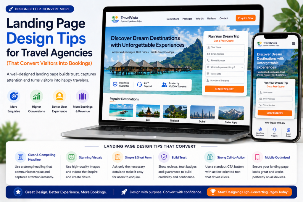
Design Principle #2: Hero Image — The Emotion Engine of Your Landing Page
For travel agencies, the hero image is arguably the most powerful design element on the page. Before the visitor reads a single word, the hero image has already set an emotional tone and communicated something about the quality and style of your agency.
What Makes a Great Travel Landing Page Hero Image
Authentic over stock. We’ve said this before but it bears repeating in design terms: authentic photography communicates something stock imagery fundamentally cannot — that your agency has genuine first-hand experience of the places you’re selling. A photo taken by your Maldives specialist during their last resort visit tells a visual story that a Getty Images beach photo never will.
Aspirational but realistic. The best travel hero images make the visitor feel something — they should look at the image and think “I want to be there.” But they should also be realistic enough to be believable. Over-retouched, impossibly perfect images can feel less inspiring than a genuine, atmospheric shot.
Relevant to the specific campaign. A Maldives honeymoon landing page should have a Maldives hero image — ideally one that evokes romance and luxury specifically. A Kenya safari page should lead with a dramatic wildlife shot. The image should immediately confirm to the visitor that they’re in the right place.
Human elements when appropriate. Images featuring real people — a couple on a beach, a family watching a sunset, a traveller exploring a market — perform well because they help visitors project themselves into the scene. Use these selectively and ensure they feel authentic, not staged.
Hero Image Technical Specifications
- Dimensions: 1920×1080px minimum for desktop, with a mobile-specific crop available
- File size: Compress to under 200KB using TinyPNG or ShortPixel — uncompressed hero images are the single biggest page speed killer
- Format: WebP where your platform supports it; JPEG as a fallback
- Text overlay: If placing text over the image, ensure sufficient contrast — use a semi-transparent dark overlay behind white text, or position text on a lighter area of the image
Design Principle #3: Colour — Use It to Direct Attention, Not Decorate
Colour on a landing page should serve a functional purpose — not just make the page look attractive.
The Travel Agency Colour Strategy
Brand colours for credibility and recognition. Use your agency’s brand colours consistently throughout the page — this signals professionalism and builds brand recall.
Contrasting CTA colour for conversion. Your enquiry form submit button should be a colour that contrasts visibly with the rest of the page. If your brand is predominantly blue, use an orange or green CTA button. The button should stand out — the eye should be drawn to it naturally.
White or light backgrounds for trust. Dark backgrounds can look dramatic but they suppress conversion on most landing pages. White or light backgrounds feel cleaner, more trustworthy, and make text and photography easier to engage with.
Photography does the emotional colour work. You don’t need a colourful layout to evoke the feeling of the Maldives. Let your photography carry the warmth, the blues, the golden light. Keep the layout clean and let the imagery breathe.
Colour Mistakes to Avoid
- A CTA button that uses the same colour as your background or header — it disappears visually
- Too many accent colours competing for attention
- Dark backgrounds that make testimonial text and form fields hard to read
- Excessive use of red (signals warning in most cultural contexts) outside of specific urgency elements
Design Principle #4: Typography — Readable, Hierarchical, On-Brand
Typography choices significantly affect how professional your landing page feels and how easy it is to read — which directly impacts how long visitors stay and how likely they are to convert.
Typography Best Practices for Travel Landing Pages
Font pairing: Use a maximum of two fonts — one for headings (ideally something with personality that reflects your brand) and one for body text (a clean, highly readable sans-serif). More than two fonts creates visual noise.
Font size hierarchy:
- H1 (main headline): 36–48px on desktop, 28–36px on mobile
- H2 (section headings): 24–32px
- Body text: 16–18px — never smaller than 16px on mobile (smaller text causes iOS to auto-zoom, breaking your layout)
- CTA button text: 16–20px, bold
Line spacing: Body text line height should be 1.5–1.7x the font size. Cramped text is harder to read and signals low quality. Generous line spacing makes text feel premium — which matters on a luxury travel landing page.
Contrast: Body text should have a contrast ratio of at least 4.5:1 against its background. Dark grey (#333333) on white is easier to read and less harsh than pure black (#000000) on white.
Design Principle #5: White Space — The Premium Design Signal
White space — empty space between elements — is one of the most underused design tools on travel agency landing pages. And it’s particularly important in travel, where your audience often skews toward premium or luxury customers who associate generous spacing with quality.
Compare the visual experience of a budget airline website (cluttered, every pixel used, overwhelming) with a luxury travel brand website (generous spacing, each element given room to breathe). The spacing itself communicates a quality signal before the visitor has read a word.
How to Use White Space on Travel Landing Pages
Between sections: Leave at least 60–80px of vertical space between major sections. This gives the eye a moment to rest between pieces of information.
Around the CTA: Give your CTA button generous white space on all sides. An isolated button is harder to miss than one surrounded by competing elements.
In the benefits section: If you’re using a three-column benefits layout, leave space between the columns. Cramped columns feel low-budget.
Around testimonials: Let each testimonial breathe. A testimonial surrounded by white space feels more considered and credible than one crammed between other elements.
The counter-intuitive insight: A landing page with generous white space often converts better than a longer, denser page with the same information — because the white space makes each element more impactful and the page easier to process.
Design Principle #6: The Enquiry Form — Design for Completion
Your enquiry form is the most important functional element on the page — and it deserves careful design attention, not just functional attention.
Form Design Best Practices
Single column layout. Multi-column forms look compact but are significantly harder to complete on mobile. Always use single-column form fields that stack vertically.
Full-width fields. Full-width input fields are easier to tap on mobile and look cleaner on desktop. Avoid narrow or oddly sized fields.
Generous field height. Form fields should be at least 44px tall — the minimum comfortable tap target size on mobile. Taller fields (50–56px) look more premium and are easier to use.
Clear field labels. Labels should be above each field (not inside, where they disappear when the visitor starts typing) and in a clear, readable size.
Submit button width. On mobile, the submit button should be full-width — making it large and easy to tap. On desktop, it can be narrower but should remain prominent.
Form card design. On destination-specific landing pages, consider placing the form inside a visually distinct “card” — a white or lightly coloured box with a subtle shadow. This draws the eye to the form and separates it visually from the surrounding page content.
Proximity to social proof. Place your strongest testimonial or review summary immediately adjacent to the form — either directly above or to the side on desktop. The form is where hesitation peaks; trust signals at that exact moment make a measurable difference.
Design Principle #7: Mobile Layout — Design for Thumbs First
More than 60% of travel search traffic arrives on mobile. Your landing page design should be built for mobile first — then adapted for desktop, not the other way around.
Mobile-Specific Design Considerations
Stack everything vertically. Multi-column desktop layouts need to collapse into single-column mobile layouts. Two-column benefit sections become a single scrolling list. Side-by-side form and testimonial layouts stack vertically.
Thumb-friendly tap targets. Any interactive element — buttons, form fields, phone number links — should be at least 44×44px. The “hit area” matters as much as the visible element size.
Hero image aspect ratio. Portrait (9:16 or 4:5) images work better on mobile hero sections than landscape (16:9) images, which become small and uninspiring when viewed on a vertical screen.
Sticky CTA bar. On longer mobile landing pages, consider a sticky bottom bar with a phone number and “Enquire Now” button that remains visible as the visitor scrolls. This keeps the conversion option accessible without the visitor having to scroll back up.
Text size. Body text should be 16px minimum on mobile — smaller text requires zooming, which breaks the user experience and signals a poorly optimised page.
Test on a real device. The single most important mobile design step: test your landing page on your own phone. Then ask someone with a different phone (different screen size, different OS) to test it too. Emulators in design tools don’t catch everything.
Design Principle #8: Trust Signal Design — Make Them Visible and Credible
Trust signals — ATOL/ABTA logos, review badges, customer photo galleries — work only if they’re designed to be seen. Buried trust signals are as bad as no trust signals.
Trust Signal Placement Design
Trust bar below the hero: A horizontal row of trust signals (ATOL, ABTA, Trustpilot rating, review count) placed immediately below the hero section is one of the highest-impact design elements on a travel landing page. It’s seen by nearly every visitor and takes up minimal space.
Trustpilot or Google widget near the form: Use an embedded Trustpilot or Google review widget (if your platform supports it) positioned adjacent to the enquiry form. Live, independently verified ratings carry more weight than self-designed star ratings.
Testimonial design: Each testimonial should include:
- The reviewer’s name (first name + last initial at minimum)
- The destination and trip date
- A star rating displayed visually
- A photo of the customer if available
- Optionally, a photo from their trip
A well-designed testimonial card — clean background, clear typography, visible star rating — converts significantly better than a plain text quote.
Team headshot near the form: A photo of the specialist who will handle the enquiry, positioned near the form with a short introduction (“Your Maldives specialist — [Name] has visited 40 Maldives resorts personally”), adds a powerful human trust signal at the moment of maximum hesitation.
Design Principle #9: Page Speed as a Design Constraint
Page speed isn’t just a technical issue — it’s a design constraint that should inform every design decision you make.
Every additional design element you add to a landing page has a potential page speed cost:
- Large hero images → slow load
- Multiple image panels → slow load
- Embedded video → slow load
- Heavy fonts → slow load
- Animation and parallax effects → slow load
Design Decisions That Protect Page Speed
Compress all images before upload. Every image on your landing page should be compressed using TinyPNG or ShortPixel before uploading. This typically reduces file size by 60–80% with no visible quality loss.
Limit fonts to two. Every additional Google Font you load adds an HTTP request and increases load time.
Use CSS animations sparingly. Subtle entrance animations can enhance the experience. Complex parallax scrolling and heavy JavaScript animations slow the page and add no conversion value.
Lazy load below-the-fold images. Images below the fold don’t need to load until the visitor scrolls to them. Most page builders support lazy loading — enable it.
Test speed before and after major design changes. Run PageSpeed Insights (pagespeed.web.dev) before and after any significant design update. A beautiful redesign that drops your mobile score from 75 to 45 is a net negative.
Design Principle #10: A/B Test Your Design Decisions
Design preferences are subjective. Conversion data is not.
Rather than debating whether a blue or orange CTA button converts better, or whether a two-column or single-column benefit layout is more effective — test it.
A/B testing lets you run two versions of your page simultaneously and measure which one generates more enquiries. Over time, this removes guesswork from your design decisions entirely.
What to test first on a travel landing page:
- Hero image (authentic photography vs professional stock)
- CTA button colour (contrasting colour vs brand colour)
- Headline (two different formulas or angles)
- Form position (hero section vs below benefits)
- Testimonial placement (adjacent to form vs below form)
Run each test until you have at least 200–300 form views for statistical significance. Use Unbounce, Google Optimize, or VWO to manage tests.
Document every test result — you’re building a library of what works for your specific audience, which becomes increasingly valuable over time.
Travel Landing Page Design Checklist
Before publishing any landing page, run through this design checklist:
Visual Hierarchy:
- Headline is the most prominent text element
- CTA button contrasts visibly with the surrounding design
- Visual order guides the eye from hero → headline → CTA → social proof
Hero Image:
- Authentic photography preferred over stock
- Compressed to under 200KB
- Text overlay has sufficient contrast
Colour:
- CTA button colour contrasts with page background
- Maximum two accent colours used
- Background is white or light for trust and readability
Typography:
- Maximum two fonts used
- Body text minimum 16px
- Line height 1.5–1.7x font size
White Space:
- 60–80px between major sections
- Generous space around CTA
- Testimonials have room to breathe
Form Design:
- Single column layout
- Full-width fields
- Fields minimum 44px tall
- Submit button full-width on mobile
Mobile:
- All columns stack vertically on mobile
- All tap targets minimum 44×44px
- Body text minimum 16px
- Tested on a real mobile device
Trust Signals:
- Trust bar visible below hero
- ATOL/ABTA logos visible without scrolling on desktop
- Testimonials positioned near the form
- Team headshot near the form
Page Speed:
- All images compressed
- PageSpeed mobile score above 75
- Lazy loading enabled for below-fold images
Common Travel Landing Page Design Mistakes ❌
1. Designing for desktop only More than 60% of your visitors are on mobile. Design mobile-first and adapt for desktop — not the other way around.
2. A CTA button that blends into the design If your button colour matches your background or header colour, it will be missed by visitors who are scanning rather than reading. Make it impossible to overlook.
3. Hero images that push the headline below the fold Your headline must be visible without scrolling. If your hero image is so tall that the headline disappears below the fold on mobile, reduce the image height.
4. Testimonials that look designed rather than real Over-designed testimonial sections — with custom illustrations, cartoon avatars, and branded colour schemes — can actually reduce credibility. Real photos, real names, and simple typography feel more authentic and convert better.
5. Sacrificing speed for visual complexity Animation, parallax effects, and multiple large video panels look impressive in a design portfolio but slow your page and reduce conversions. Keep it clean, fast, and functional.
Final Thoughts
The best landing page design for travel agencies isn’t the most visually complex or the most creatively ambitious. It’s the design that guides every visitor from arrival to enquiry as smoothly and confidently as possible — using visual hierarchy, authentic photography, generous white space, and carefully considered trust signals to build confidence and remove hesitation.
Design everything with conversion in mind. Let the photography carry the emotion. Let the white space signal premium quality. And let the data — from A/B tests and heatmaps — make your design decisions for you over time.
For the complete picture of your travel landing page strategy, read our guides on how to write landing page copy for travel agencies and landing page best practices for travel agencies. And head back to our Complete Digital Marketing Guide for Travel Agencies for the full strategy. 🌍